Bivant

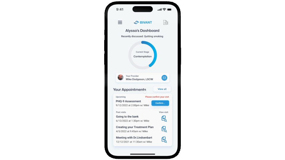
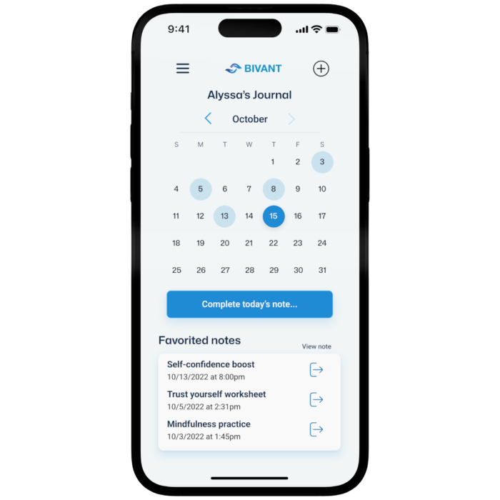
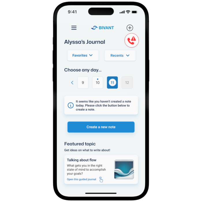
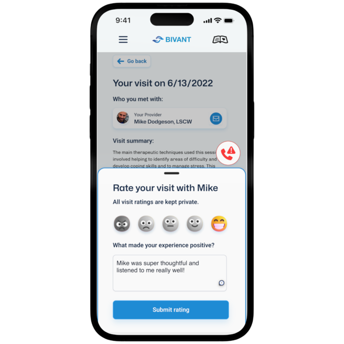
In mental health therapy, there has never been a good way for a therapist to get feedback from their patients. Furthermore, patients have been denied a voice regarding their treatment.


Bivant seeks to change this by respecting boundaries, bridging gaps, and inspiring hope.

Background

There always has been a split between patients and providers in mental health treatment. There have been efforts to make mental health treatment more collaborative. These have failed because of resistance from providers.


Providers fear it will make patients more anxious, add unnecessary time to visits, and lead to unfavorable results for PTSD patients.

Forced Change

The 21st Century Cures Act was put into effect into 2021. It says that when patients ask for their test results, drug lists, or clinical notes, they should be able to get them quickly and in full. This was a win for patients because it removed many barriers to involvement in their treatment. 

Challenge: 

I led the research, designing, content strategy, project management, and prototyping of the Bivant mobile app. I used a service design philosophy to ensure from brand creation to final execution, Bivant gives users the best experience possible before even entering the platform.

My Role:

I led the research, designing, content strategy, project management, and prototyping of the Bivant mobile app. I used a service design philosophy to ensure from brand creation to final execution, Bivant gives users the best experience possible before even entering the platform.

Source of the Split

For providers and patients to be more open and work together, I had to figure out what was causing the split. From secondary industry research and user interviews, I found there are reasons for providers and patients. 

Key Beginning Findings

It’s hard for patients to understand medical terms and they’ve always needed help starting talks about clinical notes. 

Only 16% of patients admitted to their provider that they read their clinical notes.

Some studies have found that patients feel judged, offended by their notes, and more anxious.

Deeper Dive into the Provider

I was able to dig deeper by working one-on-one with case workers and using participant observation and a diary study. I watched how case workers got patients involved in their care and how the patients felt afterwards.


After every workday for a week, I sent providers a diary study that focused on how they felt and how involved patients were in their treatment.

Providers reported difficulties finishing their notes on time, keeping patients attentive during sessions, and failing to attend visits. In all of the answers to the diary study, providers said they thought their patients were involved enough in their care. 

Deeper Dive into the Patient

Through user interviews, I could speak with folks who had gotten treatment for a mental health problem. Users cited issues with remembering what was said during their appointments.

To ensure patient privacy, all patients signed an informed consent form, and all individual interviews were erased following data collection

"I really felt like my first experience meeting my provider wasn't collaborative. The vibe I got was, sort of indifference and I didn't have much input on my treatment options."

Users also noted that it took a lot of work for them to notice progress. They expected there to be more rapid improvement in the recovery process.

"I didn't really feel like I gained a lot from my sessions. It felt like nothing was changing. The only valuable thing I remember learning was defensive mechanisms."

Surrounding Factors

For providers and patients to be more open and work together, I had to figure out what was causing the split. From secondary industry research and user interviews, I found there are reasons for providers and patients. 


Notable examples are:

  • Healthcare IT Departments
  • the Office of the National Coordinator for Health IT (in the USA)
  • Electronic Health Record System Organizations (Epic, Cerner, Qualifacts)


For an adequate solution to be adopted by providers, the following internal and external parties would need to be addressed.

Defining Principles

Design standards had to be set up to make a system that would work for patients, providers, and their organizations for a long time. The design standards I chose are the following:


  1. Respecting Boundaries
  2. Bridging Gaps
  3. Inspiring Hope


Respecting Boundaries

I want to ensure that patients stay within their professional relationships with their providers. 

Also, I want to preserve the patient and provider relationship. 

Bridging Gaps

I want to help patients communicate openly with their providers to address treatment goals.

Inspiring Hope

I want to give patients a way to see how they’re doing and give providers confidence in collaborative treatment. 

Goals & Setting Constraints

I needed to identify the key goals and constraints to focus this project further. The rules are separated into content (what’s in the solution), audience (those who use it), and format (how it can be used). These constraints and goals are accumulated into 3 “how might we” statements.

Key Goals

  • Patients feel as though their health data is safe secure
  • Providers to become more focused
  • Patients to make progress
  • Providers feel comfortable expressing their thoughts

Constraints

Content

Audience

Format

  • We won’t be providing a quick fix
  • We won’t be using quantitative data
  • We won’t be giving patients full control
  • We don’t provide direct medical advice
  • We will not manage medications
  • Mental health patients who participate in treatment in an outpatient setting
  • Caseworkers and therapists in outpatient environments
  • Those who work one-on-one a majority of the time. Group therapy environments are not a focus.
  • Providers will get a desktop view
  • Patients will get a mobile view

From the user research performed, patients wanted a more accessible way to access their information. A mobile app would be the best solution because it would allow patients to access information when they want it.

Keeping Patients Engaged

Research has shown patients to be more engaged when establishing their identity. Bivant gives users a sense of who they are by putting a clear progress indicator on an essential goal of their treatment plan.


Additionally, Bivant allows users to give feedback on their most recent visit. This enables users to provide input on their experience and thus feel important. 


Lastly, patients can keep up with a journal. This journal allows them to have a daily way of interacting with their treatment through reflection. Through daily interaction, the patient becomes more engaged over time.

The Zeigarnik Effect says that people remember unfinished jobs better than finished ones. This is what we’re doing here. By keeping a clear progress indicator visible on the dashboard, the patient is more likely to remember the most important goal of their treatment plan.

Motivating Providers and Patients

Bivant motivates patients and providers to work together by promoting transparency effectively. Through the onboarding process, users can easily share their records with a new provider.


This motivates providers because it makes it simple for them to get permission for records. It also makes it easier for them to prepare for sessions with a new patient. 


In my research, the users mentioned a key pain point of retrieving records. Through this process, records are readily obtainable for patients.

I’m utilizing the Principle of Least Effort. I integrated requesting records into the onboarding process. While this makes the onboarding longer, it makes the rest of the experience simple. Users cited this as better.

Organizing Appointments, Together

Bivant allows providers and patients to work on appointments together through confirmation. Patients are asked to confirm any upcoming appointments. They’re given the necessary details and a way to cancel if needed. They can also directly contact their provider.


By guiding the patient to confirm their session and read the description, they will be more likely to remember the purpose of the appointment. 


Ultimately, it helps the appointment to stay focused and decreases the chance of no-shows.

Iterations through Testing

Method:

Tools used:

Moderated Usability Testing

Zoom, Useberry

Link to original usability test: 

Requesting Records During Onboarding

Participants cited two critical issues with the old way of requesting records, when you did it and what records you could request. Most participants noted they’d more likely only request records when transferring providers. 


Also, participants cited that some of the terminologies needed to be clarified. None of them knew what a PHQ-9 Assessment was.


I changed this by first adding it to the onboarding process. I could make the experience easier once the onboarding was done and put the feature where users were more likely to need it. Afterward, I changed the terminology to make it more recognizable to the end user.

I used an understanding of Fitts’ Law to help me optimize my touch targets. According to the law, touch 

Making Journaling Personal

Before
After

Initially, the journaling experience showed a monthly calendar. Users cited that this made it challenging to select a day and took up too much space on the page.


I changed this by making it a recent day’s calendar, where the user can click an arrow to go back. Also, users said they would like an alternative to guided notes if they wanted to type out how they felt. 


I added the additional option for users to write a freeform journal. This allows users to personalize their journaling experience, making it theirs.

I used an understanding of Fitts’ Law to help me optimize my touch targets. According to the law, touch targets should be large enough for users to select accurately. I relooked at my touch targets and ensured they were large enough for many different types of users.

Providers Taking Feedback

At first, the button that is called “give feedback” was where the “request records” button was. Since requesting records changed, the opportunity to give feedback to a provider would be the best way to fill up the space.


In my research, users said they wanted to give feedback but were afraid to do so. The goal is to help users feel more comfortable giving feedback. This is done through the specification that feedback is anonymous and the friendly emojis. 


Also, I made the experience as minimal as possible to promote giving feedback. That’s why only a Likert scale and a small text box exist. 

The principle I followed for this iteration was Occam’s Razor, which states that avoiding complexity is the best way to reduce it. I made a wireframe and removed unnecessary elements before putting it into hi-fi. 

Before
After

Future Plans